Never a Wrong Time for Fiona Hall

“Time is marching on, but we seem to be going the other way”
Fiona Hall

IMG_3837 IMG_3836 IMG_3850 
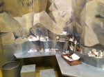
Fiona Hall was a very early influence on the way I thought about art.  I had first seen her work “Dead in the Water” at the Art Gallery of NSW more than 15 years ago in a group exhibition and can’t recall the theme of the exhibition. She had drilled small holes in plastic piping and suspended them in a glass tank. I was impressed with the way she was able to get her message across and the skill in presentation. She was selected to represent Australia in the 2015 Venice Biennale and the show, Wrong Way Time, was displayed at the National Gallery of Australia in Canberra along with her earlier works in the NGA collection.


IMG_3847

The exhibition reminded me of her early exquisite drawings over bank notes that had made me first explore the qualities of gouache. Her ability ranges from the attention to the minutae to large sculptural installations such as Folly for Mrs Macquarie.

The trip to the gallery reminded me of much I drew from her work and the idea of always experimenting with materials. The play may not come to fruition but there is never a wrong way.

IMG_3843 IMG_3845 IMG_3846

IMG_3839

Pink, Play, Print and Black

NGAIMG_3308

Everything old is new again at the National Gallery of Australia. A trip to see Tom Roberts meant an additional opportunity to take in old favourites in new spots. What a difference a re-hang can make! We missed some familiar faces but there was a chance to see what a wall and light can do for a work.

NGA

Sculptor Inge King exhibition


The Playroom

IMG_3276 IMG_3275 IMG_3272 IMG_3278 IMG_3279


“All Australian paintings are in some way a homage to Tom Roberts”.  Arthur Boyd

Starting with Tom Roberts, we avoided the increasing crowds and got in early so we had him all to ourselves.  This advantage meant we could go into the kids interactive room with no kids. I just wish there was a space like this for adults. Little easels for re-creating portraits, dress-up, saddled lambs and an app projected onto a wall to allow movement of figures into the landscape in a playful way.  Simply playing opens new and wonderful ways of working. Why do we have to stop? Standing in front of works studying the paint and structure is a wonderful opportunity to examine Roberts underglazing of luminous pink peeking from under the cracks, but how wonderful would it be to have a room to express that on the spot, to sketch without feeling slightly wanker-ish in front of gallery on-lookers.

“Here is a workshop, there are no rules, do what you want to do.”   Kenneth Tyler

Stella: The Fountain

Stella: The Fountain

Upstairs the Tyler Graphics exhibition: Behind the Scenes, showed play at an expert and amplified level. Extraordinary works of printing and the use of paper pulp by Rosenquist and Caro left me wanting to shred, pulp and construct.  The fabulous line and strength of Joan Mitchell’s marks showed the ability to translate freshness into print. A sequence of short films gave an insight into the complexity and flexibility of printmaking and the process to produce Frank Stella’s  “The Fountain” left me feeling nervous, exhausted and a newfound respect for prints of multiple techniques at this size.

Caro Angle#8

Caro: Angle #8


After the intensity of Roberts and Tyler, a small unobtrusive exhibition simply called BLACK pared it all back. The entrance lured us in with a glimpse of too abstract expressionist giants: Motherwell and Guston side by side. Inside Serra sat comfortably alongside ancient forms, the “ground breaking” blackness of Malevich and the light inside the darkness of Soulages. This exhibition was a fabulous use of stored masterpieces within the NGA collection. Darkness all aired out.

BLACK: Motherwell & Guston

BLACK: Motherwell & Guston


Above all the new hang and the changes within the NGA have been wonderful, a breath of fresh paint.

I’d Rather Go by Motherwell than a Stairwell…

“The wind carried away the cottonwool

At five in the afternoon.

And the oxide scattered crystal and nickel

At five in the afternoon”.  Garcia Lorca: Lament for Ignacio Sanchez Mejias.

Motherwell 1

Burning elegy artists proof

Canberra in winter is bitingly cold, a stark blue sky and cool grey concrete of the National Gallery seems like a world away from Spain and New York but the last couple of days I’ve felt the intensity of bullfights and the pain in painting.


photo(91)Robert Motherwell : At Five in the Afternoon currently at the National Gallery is a selection of prints from the Gallery’s collection and the curator Jane Kinsman gave a talk and some insight into Motherwells practice of printmaking.  The works spread across three rooms were brilliantly curated and each work was fabulous but a selection of small lithographs were simple and exquisite and captured the same emotions of the larger striking painterly works.

Lament for Lorca:

Lament for Lorca:


Some of the larger prints utilising graphics from cigarette packets reinforced that peculiar artist habit of finding inspiration in the mundane.  I remember as a child enamoured with the cigarette packets we used to sell in the boat hire business, Camel and Fiesta were my favourites but later I photographed old packets a friend had in their scrapbook for painted works not realising Motherwell too was drawn by the colour and shape.  Up until stumbling across John’s curious arty collection, I had tried to draw a camel packet from memory.


Motherwell: Hermitage

Motherwell: Hermitage

John's cigarette scrapbookMotherwell’s prints incorporating imagery and my painted works, now capture a lost period.  Smoking was acceptable and a filthy dangerous habit that I (for a short time) and Motherwell embraced.  Packets were bright and engaging. Cigarette packaging in Australia is now a dark, dull, khaki green and the only images gangrenous limbs and health warnings.  And I guess like any image, even cancerous body parts and minimalist packaging will provide some sort of inspiration for other artists down the line.


After the talk, we hit the wine and felt glad Motherwell had chosen drinking and painting over suicide. We are so much richer for his work and his immersion in the poetry of Lorca. We went back again the next day for another hit before heading home, did a swing by the Indigenous and Australian gallery and we had a choice – down the stairs or back through the exhibition?


I’D RATHER GO BY MOTHERWELL THAN A STAIRWELL.

Peter Stuyvesant

Detail from my Peter Stuyvesant painting

Too Many Artists, Not Enough Life

"We Are All Water" detail Yoko Ono MCA Sydney

“We Are All Water” detail Yoko Ono MCA Sydney

According to WordPress the visits to my blog last year would have filled the Sydney Opera House concert hall 7 times over. Phew! That’s quite a performance so I guess this year I’ll try for an encore, by way of thanks.  It’s just been a little difficult with life getting in the way of art.  Ironically enough it’s art getting in the way of art, each time I look into an artist or work it takes me on a journey further, it seems, from my own.  So far this year I’ve taken in 3 major exhibitions and it’s not even 2 weeks in, Gold of the Incas, Mapping the World and Yoko Ono.  Once upon a time the map exhibition would have fed my drawing, I would have pulled out old maps and torn them apart, a bit like this.

map collage

map collage

The brilliant feathers in the Inca fabrics would have seem me oozing colours onto a palette and Yoko Ono would have set me to task at refining my messy abstract expressionist head.

Ica-Chincha Culture Tabard made from feathers. 1100-1476 AD

Ica-Chincha Culture Tabard made from feathers. 1100-1476 AD

Instead I gathered the room ephemera, stacked it on the table and looked at other artists and galleries across the world. At home Christian Boltanski and Roman Ondak are visiting but in London my investigations into the world of Rachel Whiteread and in America, Richard Serra have taken hold.  Listening to John Kaldor in a recent interview, he explained why he brought Christo to wrap our shores.  He was priveleged in travel to see what was happening across the world and wanted to share that knowledge with people.  Now we have the privelege of the web, we can travel across the world to galleries, find artists we never knew or learnt about, find our tribe and people who share a passion for art.  Hopefully I can tear myself away long enough to pick up a brush.

In any case hopefully someone in that concert hall out there will learn of another artist and spread the word.

The Wingman

Lawrence Hargrave sculpture that sits overlooking Wollongong from the escarpment

Lawrence Hargrave sculpture that sits overlooking Wollongong from the escarpment

Bert Flugelman had a beautiful studio amongst lyrebirds in the rainforest. It was sad news today to hear of this wonderful Australian sculptor’s passing yesterday at the age of 90.  He has left us beautiful works that are part of the Australian landscape.

Bert

Cones at National Gallery of Australia Sculpture Garden

One of my favourites is the work in the sculpture garden of the National Gallery in Canberra that is so familiar. The Australian bush is highly reflected in these wonderful stainless steel forms and people and birds are engaged by their distorted reflections.

Flugelman with Wingman by Guy Warren UOW Collection

Flugelman with Wingman by Guy Warren UOW Collection

His friend Guy Warren had won the Archibald  Prize in 1985 with a portrait “Flugelman with Wingman” and the work hangs in the library foyer at the University of Wollongong, commanding and inspiring.

Guy and Bert shared the wonderful commonality of Jamberoo, the little lush town where I had been only a few days ago with my artist friend.  The majority of his work so solidly metal and constructed had its roots in the organic and the love of the bush.

Tetrapus from Bondi Sculpture by the Sea

Tetrapus from Bondi Sculpture by the Sea

Almost The End of the Y

Experience in the Far West Stanislaus RapotecA few nights ago I went to Jackson Pollock’s and Morris Louis’ birthday party – 100 years celebration at the NGA where they transformed the sculpture garden restaurant into the Cedar Tavern for an event named “New York State of Mind”.

Before the drinks we had a talk by the curators about the exhibition but because of time they left this room out. I have blogged about the previous rooms and this is the last, the Orde Poynton Gallery.

Matter Painting Ralph BalsonA gallery named after a man who had never been to the National Gallery in Canberra but a generous benefactor who enabled us to stand in this space and marvel at the works on the walls.  Orde Poynton was held prisoner of war in Singapore and I think he would have felt a connection with the Ian Fairweather’ calligraphic abstractions that were the result of his prisoner of war experiences in the first world war.

House by the Sea Ian FairweatherDuring the talk the curator referred to this gallery as the end of the “Y” referring to the shape of the overall exhibition.  This is almost the last area of the Abstract Expressionism exhibition and it is an amazing collective of abstract artists.  Caryatid Michael Taylor

There is however one work missing from this area that is not listed here and that is a painting by Tony Tuckson #81 that was not listed on the NGA website.  Just another 2 rooms to go. Stay tuned.

Reclining Figure 1935 Hans HofmannUNTITLED 1935 Hans HofmannUntitled 1943 Hans Hofmann
Nude Study from Life Lee Krasner

Nude Study from Life 1939 Lee KrasnerUntitled IX 1983 Willem De Kooning

The Light and Dark

My last post was the third room of the Abstract Expressionism exhibition at the National Gallery Australia.  Like a cartoon story of a superhero, I had left you in that room, waiting. The next painting was by Lee Krasner Combat 1965 and I just couldn’t tackle that painting in a couple of words. All pink and orange and light, open and crisp and on the opposite wall Cool White painted in 1959 and separating those opposite ends is Jackson Pollock’s Blue Poles and Totem Lesson 2.

Cool White was painted by Krasner after the death of Jackson Pollock and her mother. The muted colours were the result of painting in the dark, suffering insomnia.  She chose to limit colour that was better tackled in the daylight.

I guess I was impressed with the difference in these works knowing our paintings are victims of circumstance.

Big Names, Big Boots, Small Paintings

At the Abstract Expressionism Symposium this was certainly the drawcard room.  The big names Pollock and Krasner dominate this room and Blue Poles is certainly hard to ignore but my two favourite works were…no! they were….no! Damn. I can’t pick. Each work was important as the next. Maybe after loading these works I can make a more informed decision.

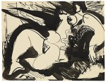
 I have put the majority of works in this room on this post but I stopped. The last work a collage by Lee Krasner felt enough for now, the next two walls were works that deserved a separate post. And I didn’t make up my mind about the best work after all, but I’m leaning towards Hans Hofmann, it feels very important spatially to me. I think I have learnt in the last few posts more about Hofmanns work than I expected and where I thought it was about the colour it turns out to be about the space. I love seeing artists in unexpected ways.

He Started It! Hans Hofmann The Middle Child.

Hans Hofmann Pre-dawn 1960Hans Hofmann’s painting is in the middle room in the Abstract Expressionism Exhibition at the National Gallery Canberra.  I think if the room was full of the artists themselves, Pollock, De Kooning, Motherwell, you know -all of them, it’s Hans Hofmann I’d want to sit with. Each time you study a great New York painter he has some connection, a thread of influence. My painting teacher, Barbara Hilder had that same effect on a whole group of south coast artists. Her words echo Hofmann “push and pull”.  Passmore had the same effect on early Australian abstractionists.

Clyfford Still’s work is reminiscent of our indigenous artist Sally Gabori’s My Grandfathers Country and Watkins work Anniversary produced in 1973 shows a continuum of work through the years.

Still: 1952 #2Dick Watkins Anniversary

The Yellow One

“I always seem to be wrapped up in the melodrama of vulgarity.”*

Normally a trip to the National Gallery in Canberra (a couple of hours drive) involves me standing in front of De Koonings Woman V for an inordinate amount of time. Studying the colour, the way the paint is laid, where it is scraped, the bones of the work. I find it difficult to move away and would like it if they moved the bench away from the front of Blue Poles so that I could have a seat.  For the Abstract Expressionism exhibition my old fave has been moved and sits entwined with other works and partially obscured by an enormous yellow painting.  Moving from “the big room” where Morris Louis pre’veiled’ Rothko gently lures you through, De Kooning sets your heart racing and them BAM! Yellow! The work above here by David Seery. So despite the Rothko, De Koonings and Gorkys I call this the yellow room, there’s no mistaking it.

* De Kooning: Collected Writings

Rothko #20Rothko MultiformRothko UntitledDe Kooning Two Figures in LandscapeDe Kooning July 4thDe Kooning Woman V (MY WOMAN FIVE!!)De Kooning Untitled (figure in landscape)Gorky Untitled 1944Gorky Plumage Landscape